My favorite project from this year would have to be the guerilla marketing. I liked being able to make an impression on the school. Learning about the purpose of design was really valuable. Knowledge of a visual hierarchy was one of the things that really helped to advanced my skills. I also like this information because it applies to many aspects of design. Something that I don't think I'll forget is being able to apply my projects to a physical building.
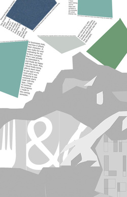 This poster for semester 1 ended up being one of my favorite projects, and I think something that really separates it from the rest of the posters in our class is how I incorporated the paragraph. In my original design I was told that it looked kind of boring, and I decided to try to change it up. I could sense a pattern of solid, geometric shapes emerging when looking back upon my work from the semester. The end result of this poster turned out so much better than my original draft, and I was really happy with it. This turned out to be a really good lesson for me about the use of typography in my designs.
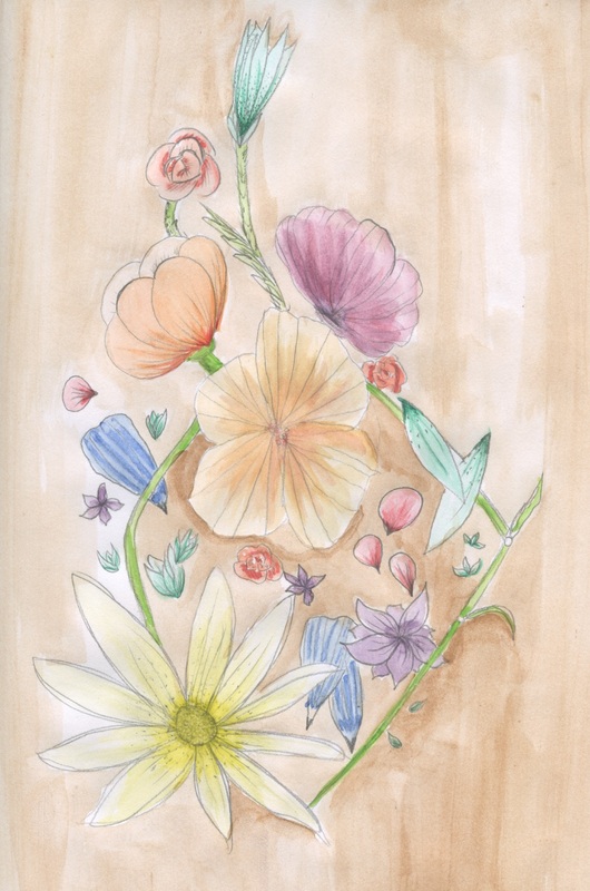
This is my favorite sketchbook page because I really liked how it turned out, and I had a lot of fun doing it. The drawing is done in pencil, and is then painted over with watercolors. Another reason I like this page is because there isn't a particular meaning behind it, it's simple and colorful, which isn't normally the direction I would go in. This page is similar to my other pages of this nine weeks because it incorporates watercolors and a natural theme. It is different from some of my other pages because it has more colors and is more heavily hand-drawn than I usually tend towards. By approaching this drawing like a design, rather than a picture that you may find in real life, I ended up liking the process better, and the end product turned out better than expected.
When we first started the class, I knew next to nothing about the principles of design. I just thought that it had to look good and simple, but has no way of knowing how to get there. There are a lot of elements that I would have been unsure of why or how they contribute to the piece.
I think that the most significant thing that I have learned is how to realize the difference from a good and bad design. Learning how to look at something and say, "There isn't a clear order," is really useful to figure out how to fix your own designs. Looking at the images above, the most drastic area of improvement is probably the simplicity. Even though there are a lot of elements in my travel poster, I feel like it isn't as busy as the first design. There also is a distinct change in the contrast between the different elements from the first design to the second. In the first, it is unclear where to look first, while in the second it is easy to tell which parts are more or less important. |
AuthorWrite something about yourself. No need to be fancy, just an overview. Archives
June 2014
Categories |


 RSS Feed
